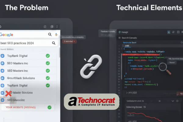
Here’s something most business owners don’t know: 88% of online visitors won’t return to a website after a bad experience. Even more surprising? A visually stunning website can have terrible conversion rates while a simpler one converts like crazy. Understanding what makes a website convert better isn’t about beauty. It’s about strategy.
Too many businesses pour money into gorgeous websites that look impressive but fail at their actual job – turning visitors into customers. A website might win design awards but lose sales every single day. This happens because most designers focus on aesthetics first and conversions second.
After analyzing hundreds of high-converting websites across different industries, clear patterns emerge. Certain design elements consistently drive conversions. Others kill them. The gap between a 2% conversion rate and a 6% conversion rate often comes down to specific, measurable design choices.
This analysis breaks down what makes a website convert better. You’ll learn which design elements matter most, why they work, and how to spot them. Whether you’re hiring a design agency or improving your current website, these insights help you separate effective design from just pretty design. Let’s look at what really works.
The Conversion vs. Aesthetics Balance
Beautiful websites don’t always make money. That’s a hard truth many business owners learn after launching their redesigned site. The problem? Design that prioritizes visual appeal over user goals creates friction. Every extra click, every confusing menu, every unclear button costs conversions.
Research from Forrester shows that good user interface design can increase conversion rates by up to 200%. Better user experience design can boost conversions by up to 400%. These numbers prove that how a website works matters more than how it looks. A high-converting website design puts user behavior first and aesthetics second.
Think about major e-commerce sites like Amazon. Their design isn’t winning awards. But their conversion rate destroys competitors. They use white space strategically. Their buttons are obvious. Their path to purchase is clear. Every element exists to move users forward.
The shift happens when designers ask different questions. Instead of “Does this look good?” they ask “Will users know what to do next?” Instead of “Is this on-trend?” they ask “Does this reduce friction?” Website conversion optimization starts with this mindset change. Pretty is a bonus. Profitable is the goal.
Many Indian businesses make this mistake. They see trendy designs on international sites and want the same. But they skip the conversion strategy behind those designs. A restaurant website with stunning food photography means nothing if customers can’t find the menu or place orders easily. A service business with artistic layouts fails if contact forms are hard to find. Design must serve business goals first.
Above-the-Fold Elements That Convert
Users decide whether to stay on your website in 3-5 seconds. What they see above the fold makes or breaks that decision. This space is your most valuable real estate. Waste it and visitors leave. Use it right and conversions jump.
The headline is your first test. Weak headlines talk about the business: “Welcome to Our Website” or “About Our Company.” Strong headlines address user problems: “Get Your Website Built in 14 Days” or “Double Your Online Sales This Quarter.” The difference is focus. Users care about their problems, not your company history.
Visual hierarchy guides eyes to what matters most. High-converting websites use size, color, and position to create a clear path. The most important element (usually your value proposition) gets prime position. The call-to-action button stands out through contrast. Supporting information sits lower in the hierarchy.
CTA placement above the fold increases conversions by 20-30% compared to below-the-fold placement. But placement alone isn’t enough. The button needs contrast, size, and clear action words. “Get Started Free” converts better than “Submit.” “See Pricing” works better than “Click Here.” Specific beats vague every time.
Trust signals belong above the fold too. Client logos, security badges, or quick stats build credibility fast. “Trusted by 500+ Indian Businesses” or “5000+ Projects Delivered” answer the unspoken question: “Can I trust this company?” Put these signals where users see them immediately.
Your value proposition must be crystal clear. Users shouldn’t guess what you do or who you help. “We Build High-Converting Websites for Indian Businesses” tells more than “Web Development Services.” Clarity wins. Cleverness confuses. Make your offer obvious in 5 seconds or less.
Color Psychology and Conversion
Color choices directly impact user behavior and conversion rates. This isn’t about personal preference. Research from the Institute for Color Research shows people make subconscious judgments about products within 90 seconds, and 62-90% of that assessment is based on color alone.
Red creates urgency. That’s why you see red on sale buttons and limited-time offers. Orange suggests friendliness and affordability. Many budget-friendly brands use orange in their CTAs. Blue builds trust and security. Banks and tech companies choose blue to signal reliability. Green represents growth and positive action. Success messages and “go” buttons often use green.
For the Indian market, color meanings carry cultural weight too. Red symbolizes prosperity and celebration. Gold represents wealth and quality. Orange holds religious significance. Blue signifies confidence. Smart website conversion optimization considers these cultural associations when choosing color schemes.
Button color matters more than most designers think. A study by HubSpot found that changing a CTA button from green to red increased conversions by 21%. Why? Not because red is better than green universally, but because red had stronger contrast against the page background. The winning color is always the one that stands out most.
Contrast drives action. Your CTA button needs enough contrast ratio (at least 4.5:1) to be immediately visible. Tools like WebAIM’s contrast checker help verify this. A beautiful monochromatic design might look sleek but fails if users can’t spot the action button.
Background colors affect readability and mood. White or light backgrounds reduce eye strain and increase reading time. Dark backgrounds work for specific industries (luxury, entertainment) but can decrease conversions for service businesses. Test your background choices against your specific audience. What works for a nightclub website fails for an accounting firm.
Typography That Makes Websites Convert Better
Font choices seem minor but significantly affect conversion rates. Hard-to-read text pushes users away fast. The Nielsen Norman Group found that users only read 20-28% of words on an average page. If your chosen font makes that harder, you lose even more attention.
Font Selection and Screen Readability
Sans-serif fonts (like Arial, Open Sans, Roboto) work best for screen reading. They’re cleaner at smaller sizes and render better across devices. Serif fonts (like Times New Roman, Georgia) can work for headlines but often reduce readability in body text on screens. High-converting landing pages typically stick to 1-2 fonts maximum. More creates visual chaos.
Reading Patterns and Eye Movement
Reading patterns follow predictable paths. The F-pattern shows users reading the full top line, then scanning down the left side of the page. The Z-pattern works for pages with less text – eyes move from top left to top right, diagonal down, then left to right again. Design your layout to match these patterns. Put important information where eyes naturally go.
Optimal Line Length and Spacing
Line length drastically impacts reading comfort. The ideal line length is 50-75 characters (about 10-15 words). Longer lines tire the eyes. Shorter lines feel choppy. Research from the Baymard Institute shows that proper line length can improve reading speed by 20%.
Line height (spacing between lines) needs proportional adjustment. A good rule: line height should be 1.5 times your font size. So 16px font needs 24px line height. Too tight and text feels cramped. Too loose and users lose their place when moving between lines.
Mobile Typography Optimization
Mobile typography requires different thinking. Font sizes that work on desktop become tiny on phones. Minimum mobile font size should be 16px for body text. Smaller text forces users to zoom, creating friction. CTA buttons need minimum 18px text for easy reading.
Hierarchy through font choices guides users through content. Headlines should be 2-3 times larger than body text. Subheadings should be 1.5-2 times larger. This creates clear visual breaks and helps users scan for relevant information. Sites with clear typographic hierarchy see lower bounce rates.
Strategic Use of White Space
White space (or negative space) is empty area around design elements. New designers fear it. Experienced designers use it strategically. Adding white space around important elements can increase attention by 20% according to human-computer interaction research.
How White Space Reduces Cognitive Load
White space reduces cognitive load. When too many elements crowd together, brains work harder to process information. This extra effort tires users and increases abandonment. Clean layouts with breathing room make decisions easier. E-commerce sites that increased white space around product images and descriptions saw conversion rate improvements of 15-30%.
Directing Attention With Empty Space
White space directs attention to what matters. When you surround a CTA button with empty space, eyes naturally focus there. The button becomes the obvious next action. Cramming a button between other elements makes it compete for attention. Isolation makes it powerful.
Margins and padding create this effect. Generous padding inside elements makes them feel larger and more important. Good margins between sections create clear boundaries. Users can distinguish different content blocks easily. Poor spacing makes everything blend together into visual noise.
Mobile vs Desktop White Space Strategy
Mobile white space works differently than desktop. Desktop designs can afford larger empty areas. Mobile screens have limited space but still need white space for clarity. The key is proportional spacing. Reduce white space on mobile but don’t eliminate it. Cramped mobile layouts frustrate users and tank conversions.
Common White Space Mistakes
Common white space mistakes hurt conversions. Filling every pixel looks cluttered. Creating uneven spacing feels unprofessional. Using white space randomly adds confusion. Strategic white space has purpose – it guides, separates, and emphasizes. Random white space just wastes space.
Line spacing, paragraph spacing, and section spacing all contribute to readability. Text blocks need space to breathe. Walls of text without paragraph breaks scare readers away. Breaking content into chunks with proper spacing increases reading time and comprehension. Google’s Material Design guidelines emphasize spacing systems for this reason.
Trust Elements and Social Proof
Trust decides whether visitors become customers. Users won’t buy from sites they don’t trust. Security concerns stop 17% of online purchases according to conversion research. Your job is removing those concerns through smart trust signal placement.
Testimonials work when done right. Generic praise like “Great service!” adds little value. Specific testimonials with real results convert better: “Our online sales increased 150% after our website redesign.” Adding photos makes testimonials 87% more trustworthy. Names and companies add credibility. Anonymous quotes raise suspicions.
Position testimonials near decision points. Put them near pricing tables, on service pages, and close to contact forms. Users look for validation right before taking action. Testimonials at these moments reduce hesitation and increase conversions.
Security badges and certifications build trust fast. SSL certificates, payment security logos, and industry certifications all signal legitimacy. Position these near forms and checkout buttons. Indian users particularly value security badges due to online fraud concerns. Display recognized certifications prominently.
Client logos establish credibility through association. If known companies trust you, new prospects feel safer. But don’t fabricate this. Using logos without permission damages credibility if discovered. Stick to clients who’ve given permission. If you’re new, use “As Featured In” media logos or industry association badges instead.
Case studies and numbers prove capability. “We’ve completed 500+ projects” or “Serving clients since 2010” provides concrete proof of experience. Convert these into visual elements – use counters, icons, or timeline graphics. Make proof visible and specific.
Review displays need authenticity signals. Star ratings from Google, Facebook, or industry platforms carry more weight than website-only reviews. Link to your actual review profiles. Show recent reviews, not just old ones. Respond to reviews (including negative ones) to show active engagement. Authentic review sections can increase conversions by 270% according to Spiegel Research Center.
Mobile-First Design: What Makes Websites Convert Better on Small Screens
Mobile traffic dominates Indian internet usage. Over 70% of web traffic in India comes from mobile devices. If your website doesn’t convert on mobile, you’re losing most potential customers. Mobile-first design isn’t optional anymore.
Mobile User Behavior Patterns
Mobile user behavior differs from desktop behavior. Further, mobile users are often distracted, on the move, or quickly comparing options. They want fast answers and easy actions. Complex navigation or tiny buttons create immediate friction. Thumb-friendly design matters – primary actions should sit in the bottom half of screens where thumbs naturally reach.
Touch-Friendly Interface Elements
Touch targets must be large enough for fingers. Apple’s Human Interface Guidelines recommend minimum 44×44 pixels for touchable elements. Smaller targets cause misclicks and frustration. Space buttons apart to prevent accidental taps. A user accidentally clicking the wrong button often abandons the task completely.
Mobile CTA Optimization
Mobile CTAs need prominence and position. Unlike desktop where multiple CTAs can work, mobile screens demand focus on one primary action. Make that action button full-width or nearly full-width. Position it where it’s immediately visible without scrolling. “Sticky” CTAs that remain visible while scrolling increase mobile conversions by 20-30%.
Form Simplification for Mobile
Form optimization is critical on mobile. Every form field you remove increases completion rates by roughly 10%. Ask only for essential information. Use appropriate keyboard types (number pad for phone numbers, email keyboard for email fields). Break long forms into steps. A three-step form feels easier than one long page.
Mobile Speed Considerations
Mobile loading speed kills or creates conversions. 53% of mobile users abandon sites that take over 3 seconds to load. Google’s research on mobile speed shows that as page load time increases from 1 to 3 seconds, bounce probability increases 32%. Optimize images aggressively. Minimize scripts. Use mobile-specific optimizations.
Indian mobile users often use slower connections. Design for 3G networks, not just 4G or WiFi. Progressive loading helps – show critical content first, then load additional elements. This creates perceived speed even when actual loading continues. Users feel the site is faster and stay engaged.
Vertical scrolling works better than horizontal swiping on mobile. Users expect to scroll down. Horizontal galleries or sliders often get missed. Keep important information in a single vertical flow. Use collapsible sections to manage length without horizontal movement.
Loading Speed and Visual Performance
Website speed directly impacts conversion rates. Amazon calculated that every 100ms of latency costs them 1% in sales. For smaller businesses, the impact is even larger. Users have less patience with unknown brands. A 2-second delay in load time increases bounce rates by 103%.
Image Optimization Strategies
Image optimization provides the biggest performance gains. Images typically account for 50-70% of page weight. Compress images without visible quality loss using tools like TinyPNG or ImageOptim. Use modern formats like WebP where supported. Serve appropriately sized images – don’t load 3000px images for 400px display spaces.
Lazy Loading Implementation
Lazy loading improves initial load times significantly. Load above-the-fold content immediately. Delay loading images further down the page until users scroll near them. This reduces initial page weight by 40-60% for image-heavy pages. Users get faster initial experience while still accessing all content.
Core Web Vitals and User Experience
Visual performance metrics matter for user experience. Largest Contentful Paint (LCP) measures when main content loads. Target under 2.5 seconds. First Input Delay (FID) measures interactivity. Keep it under 100 milliseconds. Cumulative Layout Shift (CLS) measures visual stability. Aim for under 0.1. These Core Web Vitals affect both user experience and Google rankings.
Balancing Visuals With Speed
Balance visuals with speed carefully. High-quality images and videos attract users but slow loading times push them away. The sweet spot varies by industry. E-commerce needs product images but can’t afford slow pages. Service websites need fewer images but must maintain professional appearance.
Real Device Testing
Test performance on real devices with realistic connections. Developer machines with fast internet don’t represent actual users. Use Chrome DevTools to throttle connection speed. Test on mid-range Android phones common in the Indian market. If your site crawls on these devices, most users experience poor performance.
Prioritize critical rendering path. Load essential CSS and JavaScript first. Defer non-critical scripts. Eliminate render-blocking resources. These technical optimizations let designers use rich visuals without sacrificing speed. Partner with developers who understand performance optimization alongside design implementation.
Apply Conversion Design Principles
Understanding what makes a website convert better comes down to user-focused decisions at every level. Color choices that create contrast. Typography that improves readability. White space that directs attention. Trust elements positioned at decision points. Mobile optimization that matches user behavior. Speed that keeps users engaged.
These principles work together as a system. A great CTA button fails on a slow-loading page. Perfect typography doesn’t help if trust signals are missing. Mobile optimization means nothing if desktop design ignores conversion principles. Effective design optimizes every element for the complete user journey.
Evaluating design portfolios becomes easier with this knowledge. Look for examples that demonstrate conversion thinking, not just visual appeal. Ask agencies about their approach to button placement, color psychology, mobile optimization, and performance. Request case studies with actual conversion data, not just testimonials about pretty designs.
Your current website likely has room for improvement in several of these areas. Start with quick wins: improve CTA contrast, add trust signals near forms, optimize mobile button sizes, compress images. These changes often produce measurable results within weeks. What makes a website convert better isn’t magic – it’s applying proven design principles consistently.
These conversion design principles come from analyzing hundreds of high-performing websites across industries. We apply these insights to every project we design, always prioritizing business results over just visual appeal. Design should make you money, not just look good. That’s the difference between a website and a high-converting website.
