Acing Mobile SEO in 2019
Mobile searches are globally witnessing explosive growth and it’s high time that search marketers get on the wagon. Because this opportunity is indeed worth cashing in. A large number of the population are now searching for services or products on hand-held devices. This means businesses are now having more ways of generating leads online using Mobile SEO.
Half a decade ago, experts deemed the responsive website trends and mobile-friendly sites as the goldmine. Further, websites that adapted the trend surely found favor with Google.
Similarly, the trend of Mobile-Friendly sites will continue its impact in the year 2019.
Before entering into the details. Firstly, it is important to understand
What is Mobile SEO?
Mobile SEO is a tactical way of optimizing websites as per the need of Mobile Devices like smartphones and tablets. So that websites can be easily used and perfectly viewed on each handheld device despite the different display sizes.
Previously, search engines were showing separate results to users depending on the device getting used for the search. For example, if a searcher looks for the same keyword on both Mobile devices and Desktop devices, the result will somehow vary. It is not that the results are irrelevant but a few changes can be noticed easily.
Earlier, the websites that were exclusively designed for mobile pops ups on mobile searches. Whereas, queries made on the desktop users to get only websites built and optimized for desktop. But now, with Artificial Intelligence and Rank Brain becoming part of Google Searches. Google shows the same results on the desktop as well as other handheld devices like mobile and tablet. Though a few changes are still there. But currently, the websites which fall under the mobile-first indexing gets a big boost in mobile searches.
Mobile-friendly Websites are not the only Ranking Factor in 2019.
But it is one of the major factors to boost your ranks on Google Mobile Searches. So no denial for the fact that mobile-friendly sites with SEO support will surely help you in 2019.
Having a mobile-friendly or responsive website is indeed a priority but not enough to help your business survive.
If you actually want your website to generate revenue for the business. Then you really need to ace mobile SEO. For that, you need to start thinking like your readers. Have a keen understanding of the audience who are making searches using their phones.
Searchers aren’t always in a hurry but they want the results quickly and too be handy. So, nowadays even commercial searches are becoming part of the mobile phone or a tablet search. To become a part of those searches you need to optimize your website to be SEO friendly not only for Desktops but also for mobile.
Let us move ahead and determine which mobile SEO techniques will help you with Search Engine Optimization of your website for Mobile Devices:
1. Optimize Website Contents as per Mobile Search Results
Contents are the reasons people spending time on your website. And even Google take it on a serious note. So, the very first thing which matters in terms of SEO whether it is for mobile devices or the Desktop version is the content. So the optimization of contents placed on the site is very crucial and takes lots of understanding and knowledge.
Optimize Contents relevant to your niche key phrases.
People are now searching for shorter queries and letting Google finish their phrases or keywords. So, you need to brainstorm and make a comprehensive list of keywords that you target to rank your website on Mobile searches (all searches consider responsive results these days).
You need to plan your content according to the queries Google receives. For that, you can even take the help of Google itself.
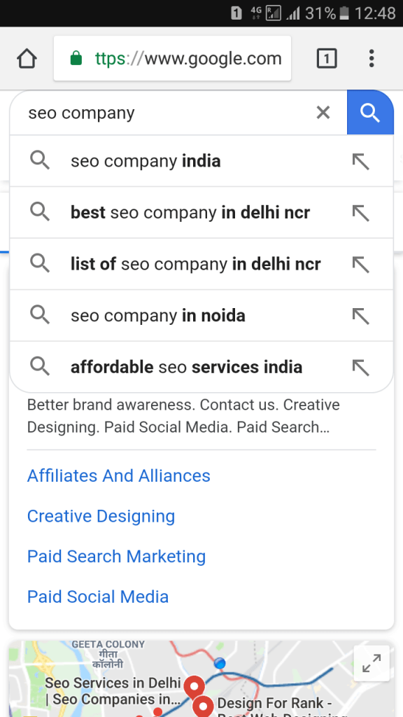
Like when you are searching for a keyword on Google Search Bar. A drop-down suggestion box appears. That box is showing the relevant key phrases which are getting more traffic from the audience in that particular location. Let us understand this by an example.
Being an SEO Company in India we are looking for competitive keywords that are currently getting major traffic on Mobile Devices. Once we type a keyword SEO Company Google itself helps us by giving relevant keyphrases that are important for our niche.
So it’s better to have free services of Google rather than using hefty paid tools to determine the keywords. Use those keyphrases within your site to get an SEO Boost.
Optimization based on Location.
In the image mentioned earlier, you can notice that Google is showing results based on the location. So if you are planning for full-proof SEO. Then you must be using location-based keyphrases as a tool to get positive results.
Now, searches are getting more local and the strange part is that keywords like “near me” phrase are becoming even more relevant for local searches.
Why so? Because Google has the capability to access your device location and show results based on your reachable geographical area only.
Erstwhile, people would google a phrase like best pizza online and a website from Germany would pop up on the first page of Google. But is the result relevant? If the search is made from the USA.
Almost a decade back or longer, Google didn’t consider detecting the location of the searcher, however, the search is far more sophisticated now and people can easily find location-relevant information without mentioning their own location explicitly.
For example, if you want to have pizza in Manhattan and need some recommendations in your own location which is also Manhattan. Then you won’t have to explicitly mention “Manhattan” in your search. Because Google will auto-detect your location if it has permission.
Further, optimize your site based on location and try to be more understandable to Google Bots, regarding your service areas and locations.
Title and Meta Description Optimisation.
There is a saying in our SEO team that if the content is the king of a website then Title and Meta Descriptions are the queens.
But is it really important to optimize title tags and meta descriptions in Mobile SEO?
Mobile Devices mainly have small screens, so you must find ways to deliver the information in those specific display sizes.
Keeping in mind the mobile search, always use concise and meaningful pieces of information in your meta description. So that readers can easily understand the niche of your webpage. Having concise and informative titles can entice the audience to click on your website. Resulting in improve CTR which is an important ranking factor.
If you are eager for good SEO results then follow all factors of on-page optimizations like titles, meta-descriptions, and quality contents keeping mobile devices in mind. Further, you can learn some more on-page SEO Strategy.
Structured Data
With small screens, it is important to deliver all the information at a time on a single screen. Because no individual likes to wait or wants to open new tabs or windows.
It is noted that with a small screen size the results with snippets generally receive more clicks and generates more CTR (Click-through ratio). Even the audience on mobile device prefers snippets. As they find it amusing to get details without visiting the actual website.
To get those snippets you must follow the rules of Structured Data. If you are delivering content in the systematical form. Then Google appreciates it and gives you Rank 0 spot on the SERP in terms of snippet whether it’s Mobile Device or Desktop.
Optimize unplayable contents.
If you are placing media files on your website which run perfectly on the desktop. But the same media is unable to play on the mobile device, resulting in bad user experience.
We all understand how bad it sounds earlier while using a Desktop device and pop up shows that a media can’t run because of the missing flash player. Every reasonable website owner doesn’t want this to happen with their audience.
So while using different formats of content on your website, think about mobile devices too. Are the formats compatible with mobile phones and tablets?
Experts suggest that using HTML5 for the purpose of video embedding can help you to improve website usability on every device despite their screen sizes.
Further, you can look at some of the Media Formats for HTML audio and video which you can use while uploading media.
Moving forward with the list of ways of properly optimizing a website. For optimal user experience on mobile phones, tablets, small screen devices.
2. Responsive Website Design for Mobile SEO
First and foremost, responsive website design itself is a method of creating the website using content, images, and structure in such a manner that it can work perfectly on every available device. Regarding different screens, browsers or devices.
Responsive web design helps you get a website which not only handles every device. But can seamlessly work on mobile devices.
In responsive web design, both the mobile site and the desktop version has the same HTML codes, URL and content irrespective of the devices.
Most of the time Responsive website designers use meta name=”viewport” tag within the site source. So that Internet Browser can easily identify the ways of properly adjusting the content based on screen size.
Either you can get a responsive website if you are creating your website on WordPress or similar platforms. As they will automatically optimize your site for every screen size without your need of declaring the viewport.
Having a responsive website is one of the major role players in Mobile SEO 2019. As it helps SEO in terms of Google indexing and crawling.
3. Separate URL based on Devices.
Before the use of Responsive Web Design mainly website owners used to have different URLs for Desktop and Mobile devices.
But today also some website owner prefers to have Separate URL, which is not necessarily important. The below image will clear your confusion on Separate URL and Responsive design has overcome it.
[Source: Search Engine Journal]
Then also it is important to discuss the Separate URL for the sake of understanding. This method involves the use of different URLs having different HTML Codes for a single website for displaying on respective screen sizes.
4. Dynamic Serving to add more to your SEO.
We can not miss out on this point. In addition to responsive web design, Dynamic Serving is also a crucial part of mobile-friendly websites. Similar to Responsive web design Dynamic serving uses a single URL for both Desktop and mobile devices. Whereas HTML code varies from one device to others, depending on the requesting user-made thru.

[Source: Dynamic serving]
The main reason behind using Dynamic serving are the heavy file like videos or similar contents. Which are too large and are not compatible with the mobile device. Having a dynamic serving gives you an advantage of specifying the view depending on users requesting devices.
5. Social Media and Mobile SEO go hand in hand
Social media applications are developed for maximum consumption of mobile or tablet usage. Since the devices are handy and let social media users stay connected even when they are on the move.
Moreover, social media is indeed a fruitful platform for distributing content and garnering leads. Search marketers must consider optimizing their content for social media shareability.
Content is indeed the backbone of any SEO Strategy and even for Mobile SEO, content is vital. But before you get down to ensuring a consistent supply of valuable content. Make sure that you have your social content distribution portals sorted.
Always ensure that your website contains are connected with social media icons. So that users can easily share your content on their social accounts.
6. Avoid Blocking of Javascript, CSS and image files.
As a search marketer, you simply can’t afford to lose the crawling by Google Bots. However, some websites don’t allow bots to crawl the java and CSS. The best way of making sure that Google is able to deem your page 100% mobile-friendly. Is by letting it do its job and thoroughly crawl the page and the files.
For such purposes, you can check your blocked resources on Google Index. To confirm if your website is getting crawled thoroughly by the Google Bots.
The best way of getting your SEO effective is by keeping all things visible to Google crawlers. Some few steps you shall follow so that Google crawlers can easily understand your website is to
- Use Google Webmaster tool services of indexing. And use “Fetch as Google” to make your sites javascript, CSS and images easily crawlable.
- Regularly check for robot.txt to satisfy the conscious of Google that you are not hiding any important page from them.
7. Avoid pop-ups and ads to get insured against Google Mobile Pop up Penalty.
Get rid of all the popups on your mobile website because Google prioritizes giving users the best experience.
But having dull pop-ups gives tasteless cocktail ads intruding in the experience that your website promises. If you really want to ace Mobile SEO for your website, make sure that you get rid of the interruptions.
Because while searching on the phone, the audience tends to have less patience. And further, they close the entire tab before even considering to close the popup look into the website.
Moreover, a penalty by Google can really harm your website if you continue to abuse the use of popups. So it is really important you pay attention to the ads running on your site. It is best to avoid pop-ups at any cost if you are interested in quality SEO.
8. Maintain speed and performance of the Website on every device.
While keeping your website speed up and running is a priority.
But make sure that you let your visitors see everything. Displaying your content concisely but without interruptions is crucial to acing Mobile SEO.
Don’t hide anything from your readers. Give them enough opportunity and space to explore the solution to the search query they made. Keep readability in your mind and optimize the content textually and visually. To make it easy for the reader to consume.
You can use tools like PageSpeed Insight tool from Google to check your page speed on different devices. It is one of the favorite developers’ tools for checking website speed.
Adding more to it, the tool is free to use and gives a detailed report where you can further check the exact performance ratio.
9. Determine your Mobile-Only with Cornerstone
When a searcher visits a website, they don’t like having a tough time navigating.
If they can’t find a vertical menu they are mostly going to bounce on other sites. Since mobile and tablet screens are shorter than a desktop. Searchers find it hard to tap on the exact section or the segment.
So, when designing the website itself, web developers and designers must also consider user-experience and interaction since people run out of patience quite fast on such devices.
Furthermore, user experience helps your website rank by retaining the engagement of your traffic. A badly designed website that doesn’t attract or retain the attention of the reader. Will definitely lose the rankings even if your SEO supports are top-notch.
Moreover, people searching on mobile are more likely to make quick searches and explore only one or two pages. They will hardly surf inner pages so make sure that you focus on making the main pages more attractive and informative than others.
10. Dodge obsolete SEO Techniques.
Cloaking or spam link building or private blog network (PBN) are not going to do your website any favors. Further, they can even get you heavily penalized.
Those cheap tricks are trends of the past now. So don’t fall for them today.
Remember that even for a mobile website and mobile SEO. Google’s bots and readers are going through the same page to keep them consistent.
Don’t try to game the system because it may just cost you your entire website. If the penalty is big enough, your website will never recover.
Mobile SEO is a lot like traditional or local SEO. This lets you ace internet marketing for your own website through sophisticated techniques and focusing on user experience.
And if you are following those spammy tricks. Then you are placing a lot of risk on your site and marketing strategy.
So avoid them at any cost. Because it is better to go slow rather than getting nowhere. Either learn some of the new SEO Tricks for 2019 which can add on to your knowledge.
11.Use ‘Rel-Canonical’ and mobile sitemaps.
A Rel=Canonical element or one can say canonical link helps in SEO’s and webmasters to prevent duplicate content problems.
For instance, if the website having a single homepage. But getting opened by different URLs then this will be a canonical error which leads to confusing Google crawlers.
The below links seem to be the same for the human eye. But for Google Crawlers all the links are representing a separate web-page.
http://www.homepage.com
https://.homepage.com
http://homepage.com
http://homepage.com/index.php
http://homepage.com/index.php?r.
Using a Rel-canonical element can help Google realize the master copy of the content. Further, it prevents duplication and tells google search to show a particular version of the URL you choose to be viewed for. Using it will help your website in the mobile version by making google understand the original content and avoid flagging.
Further, you can even use Mobile sitemaps for your website’s mobile version.to help Google easily index your website. Create an XML sitemaps so that issues like external links and the ranking signal can be easily fixed for mobile searches.
12. Moving ahead from mobile search to voice search.
Artificial Intelligence has been redefining the world for quite some time. But search marketers especially need to understand the very natural journey of a searcher from Mobile Search Engines to Voice Search.
People have been using their phones to talk to other people for decades. But today they are now talking to their phone. Thanks to artificial intelligence, the phone now replies and gets you exactly what you are looking for.
There are plenty of applications based on AI that even lets you click pictures of materialistic things, nature or anything else (except human faces) to get general information.
Today, applications like Google Lens are helping you to briefly understand the objects near you by just taking a picture of it. Results are on your mobile phone without you having to type any key phrases into the search engine.
People are now communicating their queries and issues to their smartphones through verbal communications. And if your website is not having information relevant to the need. Then you are not going to receive any response. So it is high time for those who are ignoring some serious technological advancement in recent times.
Search Marketers should focus on using this trend to their advantage. By focusing on a conversational style keyword strategy and generating content around it.
Summing up
Mobile SEO is not a battlefield overrun with the blood of search marketing gurus and new algorithmic updates masquerading as gore and mutilation. It is basic and extremely simple to implement.
Begin thinking about how people are using their smartphones to reach the solution of their queries. And bam, you have the solution.
People are now following a shorter but a conversational style of tone when searching for queries or keyphrases online. You must target these geo-specific keywords based on the long tail and short tail keywords.
Moreover, making certain technical changes to the content presentation. And adding social media handles to the website can really help you keep up with the contemporary Mobile SEO. Or take help of SEO Services Company to cover up the jobs for you.
Another big trend in Mobile SEO is Accelerated Mobile Pages (AMP) which is an open-source project by Google itself. In fact, Google prioritizes websites designed using AMP since they are quicker and load faster.
Further, give us your take on Mobile SEO. And what are the important factor according to you which can help in SEO.
A special thanks to Nagendra Singh a Chief Search Strategist at SEO Corporation for prompting us with the topic and giving some relevant ideas regarding it.
Hopefully, the information will help you understand Mobile Search Engine Optimization. And how you can effectively run SEO campaigns in 2019. Even more, you can consider our SEO Services to run successful SEO Campaigns for your websites in the year 2019.